Testing and Evaluation

The poster and leaflet were both printed and used on the night. I did not have much of chance to ask the audience members about their response to the program as I was busy in the show, but I conducted a survey afterwards with the other cast members to see what they thought of the products, one of the objectives in my planning. Below is a screenshot of the survey.

Screen shot 2014-03-20 at 11.25.34 AM


I emailed the cast this survey created through google forms, and collected the responses in a google spreadsheet. On average the poster was rated a 3.57 out of 5. The leaflet was rated 3.86 out of 5. In response to question 3, 86% of the recipients thought that the products were fit for purpose.

2 of the major improvements that came up from the survey:

1) The text was not visible and readable enough. I could have used a better font, or created more contrast between the foreground text and background image.

2) The poster was too dark, not only in terms of color but also in the atmosphere that it conveyed. More contrast in colors could have been used.

From this feedback, I think the product did not do too badly, but could have definitely been done better. I definitely agree with the second improvement, as I felt that the very heavy shadowed look on the poster did not really create a great effect. However, I am not sure how I would fulfill the first improvement, as my work with text and layout is quite limited.

http://graphicdesign.stackexchange.com/questions/21527/making-text-standout-on-detailed-photos

http://ian.umces.edu/discforum/index.php?topic=480.0

http://www.istockphoto.com/forum_messages.php?threadid=36374

I looked on some forums for methods, but most involved either putting a block behind the text, blurring the image (which I had already done) or using a drop shadow. Putting a block behind the entire text as part of the background would be feasible, something that was done for last year’s Cabaret leaflet, but I felt that it would be too much of an infringement on the visual style of the leaflet, as it would look too contemporary. Adding a drop shadow could also work, but I had always held it in my opinion that adding drop shadows to text usually made it seem more amateur. I am not sure if that is actually true though.

One thing I actually did in the design was try to blend the text and background together by making the text slightly colorized, reducing the contrast and the unnatural white color. If I had not done this and just used white, the text would probably have popped out more, so this might have been a design mistake on my part.

I emailed the client to get some feedback. Here are some images of the emails.

Screen shot 2014-03-20 at 11.46.13 AM
Screen shot 2014-03-20 at 11.46.39 AM


This is a copy of the feedback given by the client.


Dear Bryan,

Here goes.

From the initial discussions, Bryan worked tirelessly and with attention to detail, to create both a poster and program for the school production of Coram Boy that perfectly met the brief.  Throughout the creative process Bryan was responsive to feedback and took the directorial vision of the production, tying it into the central image of the poster, which was also used on the front cover of the program. The image has been described as “arresting” and elegant, strong, dramatic and bold. The colors used were also important symbolic elements in the production, and as well as staying true to the seventeenth century with the use of costume in the image, the photography also had a contemporary feel.  In both the program and poster, factual information of author, dates, times, historical background, and costs were clearly displayed.  Bryan was keen to aesthetically improve the program with further detail, and worked with initiative and perseverance throughout.  A great job! Thanks.

Ms C

Overall, the client was satisfied with the product, so the product was a success in that regard. However, I still felt that the design could have been improved extensively, and I was not really satisfied with how the product looked. But since the poster and leaflet had already been printed and used, I had no real opportunity to make alterations and improvements. The products were also made in a very short time frame, with the leaflet made in less than a week, and the rush meant that there was not too much room to evaluate and improve the product. There was still quite a bit of reflection and evaluation during the process of creation, but it was not as thorough as I would have liked.

Coram Tickets

After making the poster, I was asked to make ticket designs using the background from the poster and leaflet. I made it using Photoshop, a relatively simple process. I did not really acquire any new skills during this process, but consolidated some old techniques.

The original request:

From: ”ALLAN, Sally” < sallan@mail.sis.edu.hk >; 
Sent: 19-11-2013 13:51:44
To: ”CHAN, Bryan” < 14chanbn1@webmail.sis.edu.hk >
Cc: ”CANNON, Helen” < hcannon@mail.sis.edu.hk >; 
Subject: Ticket Designs

 Hello Bryan,

We have printed off a test copy of the programme and it looks great. We also need to make tickets for the night. Perhaps we could repeat the background we used before and make 3 different colors for the 3 nights: yellow for 3rd, blue for 4th, red for 5th.

We can talk about it during rehearsal tomorrow.

I made a start on the tickets, deciding upon the canvas size of the tickets and putting in the photo. I then used a gaussian blur to blur the picture, trying to create less focus on the background and more on the text.

Image

Seeing this, I realized that I only needed one side of the ticket to be blurred, the side with the text. I created an unblurred copy of the image, and put a layer mask on it to hide the area where the text would go, revealing the blurred layer beneath.

Image

Adding shadows and a color gradient, using the layer blending options learned before.

Image


I added the text, using the overlay blending mode. I also added a faint border and a picture of the eyes which I had extracted earlier using the channels extraction technique. I made an adjustment layer and adjusted the options for 3 different versions of the ticket.

Screen shot 2014-02-20 at 12.04.22 PM Screen shot 2014-02-20 at 12.04.30 PM Screen shot 2014-02-20 at 12.04.38 PM

Creating The Coram Boy Leaflet – Part 2

After making the token images, I had to find a way to put them into the leaflet. When I simply tried to place the image into it, the text did not wrap around the token.

Image

I applied the learning from earlier on text wrap to create a text wrap object around the token. I adjusted the dimensions to get the best look, resulting in this:

Image

After repeating the process for all the other tokens, the program was pretty much complete. I confirmed with the client that the product was satisfactory, and edited some other things like changes to the cast and crew. The program was 10 pages, a change to the 8 pages that the client originally proposed. The pages looked like this:

ImageImageImageImageImageImageImageImageImageImage


In the end, after this was sent off, 2 of the pages were condensed and the last page was cut out so that the leaflet was 8 pages and the mother’s choice page was at the back cover. Also one of the major text layout choices, aligning the 2 columns to different sides, was changed to a more orthodox layout. I would have preferred it to be the full 10 pages, but it was not too big of a difference.

I personally think the design might have worked better with a different background, or even a completely different visual style, something more contemporary and stylish. But we were already committed to the look established in the poster, something that looked a bit old-fashioned. If it were up to me I would have done it very differently, but this design was fit for purpose and fulfilled the needs of the client.

Creating The Coram Boy Leaflet – Part 1

The poster was printed and displayed, and I was also asked to create the theatre program with the details of the play, cast and crew, etc. Below is evidence of client contact in the form of an email, detailing the initial ideas and instructions for the design.

From: “ALLAN, Sally” < sallan@mail.sis.edu.hk >; 
Sent: 14-11-2013 13:40:25
To: “CHAN, Bryan” < 14chanbn1@webmail.sis.edu.hk >; “LIN, Faye” < flin@mail.sis.edu.hk >; 
Cc: “CANNON, Helen” < hcannon@mail.sis.edu.hk >; 
Subject: FW: Programme Details

 Hello Faye and Bryan,

We nearly have all of the contents of our 8 page, A5 programme.

Bryan – would it be possible to meet with me and Faye and discuss a design for each page please. The option is to have some art at the bottom of each page based on either the close up photos of the fabric of Karina’s dress blended into the colour of the page. or, we could look at the idea of using the background used in the poster and the tickets as a blend at the bottom of each page…or as a full background on each page? Hopefully we can chat after sports day tmrw or after 3.10 today. Bryan -please reply all and let us know – thanks.

page 1 -front cover – is the Coram Boy poster

page 2 – is the children’s poem – also as on foam board

page 3 -is the ‘Coram Programme’ attached – this is a background to the Coram history

page 4 – is the cast list

page 5 is the choir/orchestra – to be sent

page 6 is the crew – to be sent

page 7 is the director’s thanks – tbc

page 8 – back page- is the mother’s choice page – also as on foam board

I knew that I had to use the software Adobe InDesign, which I owned, but I had never used it before. Although I had no knowledge with the software, I hoped that my general knowledge with the Adobe interface would help me.

I really should have done more of a plan here. I had a general idea of what I wanted it to look like, but I did not make a concise plan or draw out the design. I am not entirely sure as to whether or not it would have made too much of a difference as I did not encounter any major problems, but it would have been better to have a clear idea to work towards.

I started off with something that I knew, knowing that I would have to create a background to input into the program. I spoke to the client and she gave me some ideas for the background. The first was using the fabric from one of the character’s dresses, and the second was to use the same forest background used for the poster. She asked for both to incorporate the red and black color scheme of the poster.

Starting off with a photo of the dress fabric, I used the channels selection technique I learnt earlier to select and copy the translucent fabric pattern onto a new A5 document.

Image

I then added on another image of a dress pattern, using the overlay blend mode to make it blend better with the background and other layers. I used color gradients and adjustment layers to get the hue and brightness right, layering on multiple adjustments.

ImageImageImage

The final look of the first background idea:

Image

I actually quite liked this background, and I think it would have worked well as the background. I am not sure if the pattern would have conflicted with the text, as I did not try it, but aesthetically I think it looked nicer than the trees.

I also used similar techniques to create a background using the forest drawings:
Image
In the end, the second background was selected as it had more in common with the poster, and the client wished for the common theme and images to be kept constant.
I then started the process of creating the leaflet using InDesign. I began by searching up some tutorials on getting started with Indesign:
I made the new document and filled in the settings specified by the client: A5 booklet with 8 pages. Then I placed in the page background which I had created before in Photoshop using the File > Place function. This function, as I learned, does not actively copy the image into the document but simply creates a reference link to the existing image file. That meant that I had to be careful to not move or delete any of the source files.
Image
 Image
I then input the text by using the Type tool to drag out the outline of a text box, and then copy and pasting the text that had been sent to me, including the cast list, production crew, director’s thanks, etc. I adjusted the font using the font settings bar at the top, changing the font, size, word spacing, line spacing, alignment, etc. I repeated this process for all of the text until I was satisfied with the aesthetic.
In terms of the techniques used, I think the skills utilized here were rather basic, as I really only learned what was necessary to make the leaflet. However, I am not particularly able to distinguish the difficulty of it as I have no real prior knowledge of the software.
Image
Although the text had been pasted in, the entire leaflet looked very bland and repetitive. I contacted the client to inquire about this problem.
From: “Bryan CHAN” < 14chanbn1@webmail.sis.edu.hk >; 
Sent: 21-11-2013 18:10:37
To: “ALLAN, Sally” < sallan@mail.sis.edu.hk >; “CANNON, Helen” < hcannon@mail.sis.edu.hk >; 
Subject: Coram Program
I’m a bit worried that the program doesn’t look very interesting. Do you have any suggestions of things I can add to the design before it is sent off?
From: “CANNON, Helen” < hcannon@mail.sis.edu.hk >; 
Sent: 21-11-2013 21:05:02
To: “CHAN, Bryan” < 14chanbn1@webmail.sis.edu.hk >; “ALLAN, Sally” < sallan@mail.sis.edu.hk >; 
Subject: RE: Coram Program

 Do we have any pictures of rehearsals for Page 7 ?  And then put MC on 8 as originally intended. You could add some of the token images- I have the books you could look at in DR1 office.

Ms C

The option of putting in rehearsal photos was suggested, but the images turned out to be too rough to put into the programme. So we decided to put in some images of one of the play’s motifs, orphan tokens. These included small items like coins, keys and other trinkets, and could be scattered throughout the pages.
I wanted to make the tokens quite large and have some of the text warp around the image, so I did some research on how to do this and came across some tutorials on using the text wrap function.
Now having gathered this knowledge, I set about creating the actual images to be used in the leaflet. I imported some images found online into photoshop so I could do some manual shadow and lighting work to make them fit in more.
I started with the image of the coin. I cropped out the bottom half, as the image would be on the bottom of the page. It would not have made a difference if I had not done this, but reduced the workload as I did not have to do the shadow for the bottom half. I adjusted the brightness and contrast and hue and saturation sliders to change the colors of the coin. Then I used the Transform > Skew tool to warp the shape of the coin to create the illusion of perspective.
Image
After this, I used a black brush to draw shadows around certain areas of the coin, adjusting the opacity to make them look more realistic. I also used the drop shadow on the layer effects on the coin itself to add to the shadow.
Image
I then altered the layer blending options to make the shadows more realistic, changing them mostly to the darken or multiply options for a stronger shadow.
Image
I repeated this process for 3 other tokens. After having created the images, it was time to put them into the InDesign document.

Creating The Coram Boy Poster

For the Coram Boy poster, I was initially given minimum specifications. The poster was to be made in A3, and include the motifs contained in the play, such as the idea of an angel.

Here is a transcript of some of my preliminary client contact, including ideas for the design.

HC: What I was thinking was to use some images we took of Karina and Adrian, which I can send you. Actually, I think we have them on a hard drive, and you can just go through them and pick out the ones you like. What we were thinking of was to do something with Karina’s eyes, possibly with the image of an angel, something like a stone angel statue. 

BC: Do you have any other specifications for the design? Like the style, or the color?

HC: Not particularly, I’ll let you decide that. Really the only thing that we want in the poster is the themes of the play, so the idea of the angel, the concept of reality and illusion, poverty and wealth, just all the things that the play represents. You’re in the play, so I’m sure you understand these better than anybody.

BC: When does this need to be done?

HC: Well it would be great if you could make an initial design by the end of the week. It doesn’t have to be completely finalized, but it would be good if we could just get something to see how it might shape up.

My first thought was to make a few separate posters, each showcasing a character and a setting, but all containing the same visual style and imagery as to unify them. Each poster would contain a silhouette of a character at the bottom and the angel at the top of the poster, with a setting as the background.

I was involved in the play, so had knowledge of the main characters and the ideas associated with those characters. I chose to create 3 designs for 3 characters: Meshak, Aaron, and Alexander.

I drew out the 3 concepts on paper to get an idea of the look of the poster.

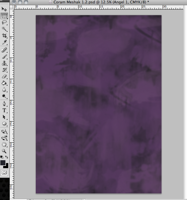
The first one is of Meshak, and will be made with a gloomy/ eerie dark purple background, created to emphasize shadow. Trees will also wrap around the sides to fit the setting of the woods.

The second image is of Aaron drowning. A blue wash for background, abstract/ iconic images and shapes used to create the underwater setting.

The final design is of Alexander. The background will be yellow and use the stage arches to show his wealthy background, and there will be images such as sheets of paper and musical notes.

I never actually got around to making this third design, as I only had time to make 2 before showing the client, and then the idea was abandoned. The third one was already the least developed even in planning, so it was probably a good idea that I did not spend more time trying to problem solve the idea.

After the initial design, I began to create the images needed for the poster. My photoshop skills were generally alright, but there were definitely skills that I needed to develop in order to create the design.

I broke the design down into its constituent parts:

  • Angel
    • Wings
    • Body
    • Glow
  • Silhouette
  • Background
    • Washes
    • Shadows
    • Trees

I began making the wings of the angel, trying to make each feather structure separately and doing the design in more of an iconic style.

I used the freehand lasso tool to draw out the shape of the feather, then filled it in with color using a pre-existing brush which I downloaded online.

I actually tried out a few methods of filling the feathers, like several brushes of varying opacity and a solid color fill. In retrospect, it might have been a good idea to try a less opaque, more wispy look to contrast the solid look of the shadow, or even done the same look for the silhouette. 

Image

I then used the scale and  Transform > Warp tool to change the dimensions of the feather. I copied the feather, changed the dimensions and angle, and repeated the process until I had a full wing. I duplicated the layers to create another wing to go on top to make a double layered design. To blend the two wing parts, I used the eraser tool to erase the border area between the two.

I had the options of using the other transform tools, like skew, distort, perspective, etc. However, I am not too sure exactly the difference between these tools, so I chose not to use them. Perhaps this is something I could explore in the future.

Image

For the body of the angel, I sort of cheated and used an image off the internet as a template, as I did not have the artistic skill to draw the body by hand or make it from scratch. I traced around the area I wanted using the magnetic lasso tool and filled it in with color just to get a sort of template.

A few weeks after making this design, I created a poster for personal uses which was hand-drawn from scratch and traced around in illustrator using the pen tool. This could have been a viable way to create the design, but at the time I did not believe that I had the skills to execute it. Also, it would have taken a long time, time which would have been wasted.

Image

I then selected the white template with the magic want tool, and used a combination of brushes to fill in the selected area. I copied in the wings which I made previously and resized them to fit the body.

Given that I had already filled the area in with white, I could have used a layer mask and brushes to achieve the reverse effect. Not sure if this would have worked though.

Image

To make the poster background, I used the brushes, laying them on top of each other to create a background. After the wash was created, I used the polygonal lasso to draw out an area that looked like a tree. Doing the same thing I did with the angel, I filled in the area with different brushes and colors. I made a few versions of the trees, and copied them to get a full border.

ImageImageImage

I then put in a silhouette of a boy, done the same way as the angel, tracing around an existing image. Afterwards, the image of the angel was put in.

As mentioned above, I could have explored the possibility of not using an opaque fill for the boy, doing a brush fill similar to the angel.

Image

All that was missing at this point was the atmosphere of the poster, and to create that I made new layers and used the brush tool to draw on certain areas in black or white for shadows or highlights respectively. I then set the opacity very low and repeated the process, creating about 8 or 9 lighting layers. There are probably better ways out there to do this, although this method is the one I am the most used to. This may be an area of research in future. Finally, I applied brightness/contrast and hue/saturation adjustment layers on top of the image to change the colors.

The final product is below, although it does not include text. I also repeated the process and used similar techniques to create the underwater poster.

ImageImage

Looking back at these, I am actually rather impressed at how they turned out, given the relative simplicity of the techniques used. Although I agree that the art style does not really fit the purpose, it still sort of works as a standalone poster.

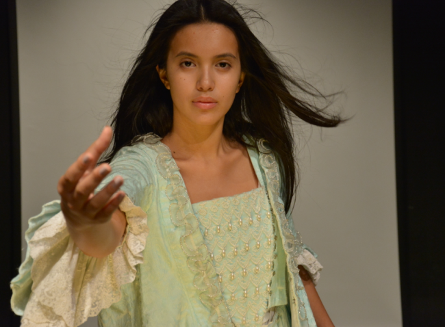
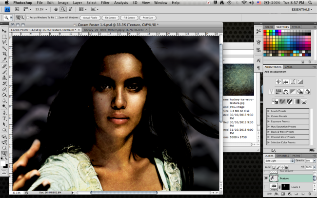
I spoke again with the client, and they said that the design was too modern to fit the theme of the play. This time, they were quite specific with the request. They gave me images to use of one of the main characters as well as a backdrop of the woods to use as the background of the poster. They requested that I use the image and increase the shadows and contrast to convey the darker more ominous side of the angel character. The background was to be blurred and turned red, so as not to clash with the color of previous poster designs.

These are some of the original images.

ImageImage

I was actually given many more images and ideas, like editing the image of a stone angel statue and superimposing eyes onto the image. I chose not to include these however, as they were absolutely terrible.

This required quite a bit of learning on my part to make, as although I knew how to use photoshop I did not have very much experience with working with photographs, and I knew that I would struggle with doing things with the image and keeping it realistic looking.

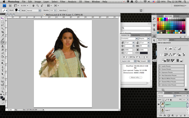
To begin, I needed to extract the image of the girl from the background. I usually use things like the lasso to do simple extractions, but I did not know how to do the detail of the hair, so I looked online to find other methods. I found multiple tutorials on how to use channels to extract hair.

http://www.youtube.com/watch?v=2P54l0nP4GY

http://www.photoshopcafe.com/tutorials/masking/masking.htm

I applied the technique to extract the image from the background. It involved duplicating a channel and using whatever methods to increase the contrast between black and white. Then the desired area is filled in with black and the unwanted part is painted white, leaving a clear distinction between the two. I command-clicked on the layer to make a selection (a skill useful in the future) and copied this into the new image or file.

I have found this to consistently be a very effective and useful technique, and if I had known it sooner I could have used it for other things, like the original angel in the first design.

ImageImage

I made a new file in a landscape A3 size, and started with the background made from the image of the trees and arches. It was quite easy to make, and simply involved applying a gaussian blur on the image and putting low-opacity layers of shadow over the top of it.

Basically all these techniques were used to degrade the original image, since its quality was rather poor, as it was a very small, close-up shot. If I had more time, I could have put more effort perhaps into creating a new background, or asking someone else for help making a background under this theme.

ImageImage

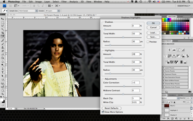
The next step was to increase the contrast and add shadows to one side of the image. I just increased the overall contrast using brightness and contrast and levels adjustment. Then looking over the adjustments bar I saw the shadows/highlights option, which I had never really used before. It seemed useful for the situation, so I experimented with it for a while, but never really understood the sliders as the labels did not make much sense to me.

I searched it up and found a few helpful explanations, then applied the effect.

http://helpx.adobe.com/photoshop/using/adjust-shadow-highlight-detail.html

http://www.dummies.com/how-to/content/fixing-exposure-with-shadowhighlight-in-photoshop-.html

http://www.photoshopessentials.com/photo-editing/shadow-highlight/

Image

After doing this I needed to add shadows to one side of the face. The only way I really knew how to do this was manually, using new layers and the brush tool. I also knew how to use the burn and dodge tools, but I felt that these methods would not really be enough and there would be better ways out there.

A few tutorials on the shadow effect:

http://www.photoshopgurus.com/forum/general-photoshop-board/22181-how-create-face-shadow.html

http://www.ozzu.com/digital-art-forum/how-make-shadow-with-photoshop-t24360.html

http://www.digitalimagemagazine.com/blog/featured/photoshop-tutorial-add-dramatic-lighting-to-portraits/

This shows the shadow effect done with brushes. The effect is very controlled and can be altered easily, but the smooth look of the brushes makes it look less realistic and gives it more of the ‘flawless unblemished skin’ look, which is not necessarily either positive or negative.

Image

The second method I tried was found online. First an adjustment layer is created over the image, in this case I used a levels adjustment to increase the black. After that, a mask is put on the adjustment layer and filled in so that only some of the darkened effect is shown.

Image

I then experimented around with the channels of the original image, trying to find a different way to do it. I duplicated the black channel and erased all the parts which I did not want, leaving only the left side of the face. I used command-click to make a selection, and copied that black in to enhance the shadows. This looks a lot like the second method, but it also exaggerated the texture on the face and made the skin look more rough.

I actually just ended up using the simpler method, as I felt the outcome looked better. The techniques were still good to pick up though, and the layer masking techniques were applied in other aspects.

Image

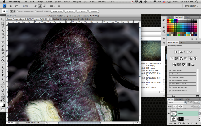
Another thing I was asked to do by the client was apply a layer of texture onto the image to make it look weathered. The texture did not have to look realistic, and was more of a stylistic choice.

I honestly had no idea how to do this. I first thought to maybe use the channel selections like before, but that did not work at all, so once again I looked to the internet for answers.

http://www.youtube.com/watch?v=GjjagNn_sMA

http://layersmagazine.com/adding-texture-to-photographs-in-photoshop.html

http://www.photoshopessentials.com/photo-effects/blend-textures-with-photos/

http://www.slrlounge.com/post-production-how-to-apply-textures-to-images-using-photoshop

Through these tutorials I learned to use layer blending modes, which I was not aware of before. I applied the technique, putting the layer on top and going through the layer modes to find a good one.

ImageImageImage

I was still a bit unsure of the meanings of different blending modes, so I found a video explaining them in more detail: http://www.youtube.com/watch?v=mibCkK1nDpI

After applying the effect, I then added layers of color gradients and shadows to the background to add to the atmosphere of the image and used adjustment layers to alter the brightness, saturation etc. I also added text.

Image

Speaking with the client, I was advised to further blend the 3 parts of the image, the foreground, background and text. I was also told to change the font. I spoke with someone with experience with photoshop and creating posters, and she told me to use the layer blending modes on the text to create a better blend. She also told me to blend the foreground and background with a sort of smoke effect and taught me a technique to create smoke.

The text was blended using the overlay mode, but it was too transparent so I duplicated the layer until it was the right opacity.

Image

The smoke cloud technique:

Use the brush to paint a few areas white. Use the liquefy tool to smudge some of the areas and create a tendril-like look to the clouds. Click edit > fade liquefy. Repeat process until satisfied.

ImageImage

I used the smoke technique, as well as downloaded smoke brushes to create smoke/ fog around the foreground image. Another technique that I used to blend the image was layer masks. I put a mask over the image such that all of it was visible. Then I used the smoky brushes as well as some general low-opacity brushes to draw on the areas around the edges the hair and dress, making them invisible. This effectively made it look like smoke was eating away at the image of the person.
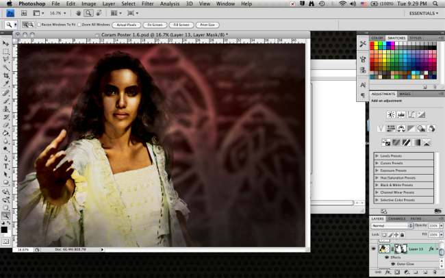
Image

The final poster:

Image


Overall, I did not particularly like the outcome of this poster. In terms of fulfilling the purpose, it was okay, as all of the things done were to the specifications of the client. However, I think it might have turned out better if I had brainstormed some ideas of my own and pitched them instead of just launching straight into the project. It could have definitely used more planning, and that would probably have resulted in something more aesthetically pleasing.

Nightfest Poster Versions

These are some of the versions that were created in response to the requests of the client.

The original version which was submitted to the PTA. The comments that came up asked for more emphasis on the text.

The original version which was submitted to the PTA. The comments that came up asked for more emphasis on the text.

This was one of the versions asked for by the PTA. It takes out the bottom area of the design and makes more room for the text. It also uses a selective wash effect in attempt to create emphasis.

This was one of the versions asked for by the PTA. It takes out the bottom area of the design and makes more room for the text. It also uses a selective wash effect in attempt to create emphasis.

This one was the final design chosen by the PTA. Although I personally think that it sacrificed too much of the original design’s repetition theme, overall it was still a good design.

This poster draws focus on the text solely by using the faded out wash effect. It also uses a color burned drop shadow to highlight the text area.

This poster draws focus on the text solely by using the faded out wash effect. It also uses a color burned drop shadow to highlight the text area.

This version puts the text in the middle for emphasis, and also uses some of the techniques in the previous ones like the drop shadow around the text bubble. This version is my personal favorite.

This version puts the text in the middle for emphasis, and also uses some of the techniques in the previous ones like the drop shadow around the text bubble. This version is my personal favorite.

I would have personally chosen this design, but any of them would have been good. After some thought I was inclined to choose this one for the poster, but design 2 for the leaflet, as it had more emphasis on text.

Coram Leaflet Aims & Objectives

Aim Objective Success Criteria
Learn technical skills required to create product.

During the creation of the product, I found that in addition to InDesign I also had to learn new skills in Photoshop. I also had to experiment around with different techniques, as I found that there were often more ways than one to achieve an outcome.

– Identify major skills and tools needed during such a project using InDesign.- Find online tutorials to teach skills

– Document learning and application of knowledge

– Find tutorials and apply knowledge of new Photoshop techniques.

– For situations where there are multiple methods, apply both, evaluate and decide.

– After the project, I should have a basic knowledge of how to do page layouts in InDesign.

– I should also have picked up new skills in Photoshop and knowledge of where best to apply new techniques.

Create the leaflet layout.

I originally anticipated to make a template of sorts before working with the actual text, but I later found that it was much easier to do the layout with the existing text in mind.

– Make a basic layout with page numbers, text boxes, borders, etc- Talk to client about what is needed inside the leaflet.

– Copy in text and any design elements needed

The leaflet needs to be informative, clear and needs to fulfill the criteria of the client. It needs to contain all of the elements and information required.
Make the leaflet look nice. – Brainstorm creative ideas for layout and design.- Edit design elements using other technical skills, like photoshop to make them fit the visual style.

– Rearrange elements and text to be aesthetically pleasing.

The leaflet should look nice. It should look professional and elegant, and should not have any large tells that make people think it was made by an amateur.I can use the client and the  cast of the play as a sample, taking surveys to gauge their satisfaction.

As I did not have a way to find who actually went to see the play, I sent a google survey to cast members. This was convenient and easy, but the results might be biased.

Another Project

The Nightfest poster was done, but the deadlines came sooner than I expected and so the full process was not carried out. The product was still made, but a lot of planning steps were foregone because it was done in a very short timeframe. I have revised the initial project description, and am currently focusing less on one single product and more on school promotions in general, so that I will be able to go through multiple products. I will still be posting evidence for the Nightfest poster, but it may be lacking and may seem out of chronological order as the other aspects of the project will still be going on.


I have also been talking with the drama department about doing promotional material within the school for the upcoming play Coram boy, including doing a leaflet to hand out on the night. The details of the play will be contained within, and the leaflet will require text layout skills and also some design elements.

Some new technical skills I will have to learn:

– Adobe InDesign. In addition to the photoshop work I have been doing, I will have to learn InDesign to do page layouts. This may be difficult as I have no experience with using this program, but a foundation of knowledge with Adobe software should help.

Client

I am in contact with Anita Clements, the vice-chair of the SIS PTA who is doing the marketing for Nightfest. I am working with the Nightfest student organizers, as well as the managing director of R&R Publishing who is designing and printing the brochure for the event.


I have also begun work on the poster itself, and so far I have had to develop my skills with photoshop in order to solve some of the problems I have faced. After encountering problems, I searched online for solutions and so far have learnt: 1) How to use the duplicate layers function to copy multiple layers into another document. 2) How to create and use adjustment layers to edit multiple layers at a time quickly and conveniently.