The poster was printed and displayed, and I was also asked to create the theatre program with the details of the play, cast and crew, etc. Below is evidence of client contact in the form of an email, detailing the initial ideas and instructions for the design.
From: “ALLAN, Sally” < sallan@mail.sis.edu.hk >;
Sent: 14-11-2013 13:40:25
To: “CHAN, Bryan” < 14chanbn1@webmail.sis.edu.hk >; “LIN, Faye” < flin@mail.sis.edu.hk >;
Cc: “CANNON, Helen” < hcannon@mail.sis.edu.hk >;
Subject: FW: Programme Details
Hello Faye and Bryan,
We nearly have all of the contents of our 8 page, A5 programme.
Bryan – would it be possible to meet with me and Faye and discuss a design for each page please. The option is to have some art at the bottom of each page based on either the close up photos of the fabric of Karina’s dress blended into the colour of the page. or, we could look at the idea of using the background used in the poster and the tickets as a blend at the bottom of each page…or as a full background on each page? Hopefully we can chat after sports day tmrw or after 3.10 today. Bryan -please reply all and let us know – thanks.
page 1 -front cover – is the Coram Boy poster
page 2 – is the children’s poem – also as on foam board
page 3 -is the ‘Coram Programme’ attached – this is a background to the Coram history
page 4 – is the cast list
page 5 is the choir/orchestra – to be sent
page 6 is the crew – to be sent
page 7 is the director’s thanks – tbc
page 8 – back page- is the mother’s choice page – also as on foam board
I knew that I had to use the software Adobe InDesign, which I owned, but I had never used it before. Although I had no knowledge with the software, I hoped that my general knowledge with the Adobe interface would help me.
I really should have done more of a plan here. I had a general idea of what I wanted it to look like, but I did not make a concise plan or draw out the design. I am not entirely sure as to whether or not it would have made too much of a difference as I did not encounter any major problems, but it would have been better to have a clear idea to work towards.
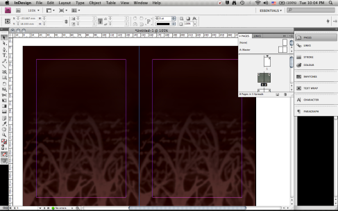
I started off with something that I knew, knowing that I would have to create a background to input into the program. I spoke to the client and she gave me some ideas for the background. The first was using the fabric from one of the character’s dresses, and the second was to use the same forest background used for the poster. She asked for both to incorporate the red and black color scheme of the poster.
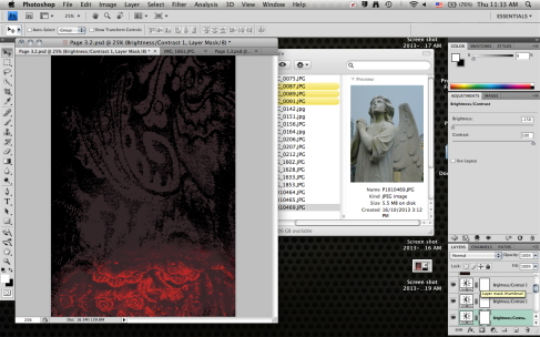
Starting off with a photo of the dress fabric, I used the channels selection technique I learnt earlier to select and copy the translucent fabric pattern onto a new A5 document.
I then added on another image of a dress pattern, using the overlay blend mode to make it blend better with the background and other layers. I used color gradients and adjustment layers to get the hue and brightness right, layering on multiple adjustments.
The final look of the first background idea:
I actually quite liked this background, and I think it would have worked well as the background. I am not sure if the pattern would have conflicted with the text, as I did not try it, but aesthetically I think it looked nicer than the trees.

From: “Bryan CHAN” < 14chanbn1@webmail.sis.edu.hk >;
Sent: 21-11-2013 18:10:37
To: “ALLAN, Sally” < sallan@mail.sis.edu.hk >; “CANNON, Helen” < hcannon@mail.sis.edu.hk >;
Subject: Coram ProgramI’m a bit worried that the program doesn’t look very interesting. Do you have any suggestions of things I can add to the design before it is sent off?From: “CANNON, Helen” < hcannon@mail.sis.edu.hk >;
Sent: 21-11-2013 21:05:02
To: “CHAN, Bryan” < 14chanbn1@webmail.sis.edu.hk >; “ALLAN, Sally” < sallan@mail.sis.edu.hk >;
Subject: RE: Coram ProgramDo we have any pictures of rehearsals for Page 7 ? And then put MC on 8 as originally intended. You could add some of the token images- I have the books you could look at in DR1 office.
Ms C


