These are some of the versions that were created in response to the requests of the client.

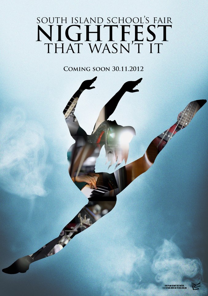
The original version which was submitted to the PTA. The comments that came up asked for more emphasis on the text.

This was one of the versions asked for by the PTA. It takes out the bottom area of the design and makes more room for the text. It also uses a selective wash effect in attempt to create emphasis.
This one was the final design chosen by the PTA. Although I personally think that it sacrificed too much of the original design’s repetition theme, overall it was still a good design.

This poster draws focus on the text solely by using the faded out wash effect. It also uses a color burned drop shadow to highlight the text area.

This version puts the text in the middle for emphasis, and also uses some of the techniques in the previous ones like the drop shadow around the text bubble. This version is my personal favorite.
I would have personally chosen this design, but any of them would have been good. After some thought I was inclined to choose this one for the poster, but design 2 for the leaflet, as it had more emphasis on text.